Hosted with
Help Center / Themes / Hello Biz Theme / Customize your Hello Biz Header

Customize your Hello Biz Header

Last Update: July 10, 2025

What is the Hello Biz Header?

Headers appear at the top of your site’s pages. They usually contain your site’s logo, navigation links for quick access to important pages and a CTA button.

See all the options available for the Header.  

Customizing your Header

To customize your Header: 
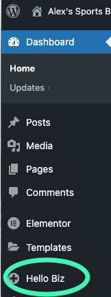
  1. Go to WP Admin.
  2. In the panel, click Hello Biz.

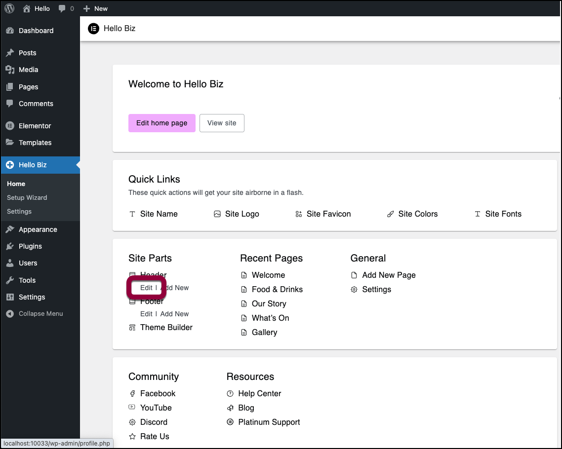
  3. In the Site Parts section under Header click Edit.
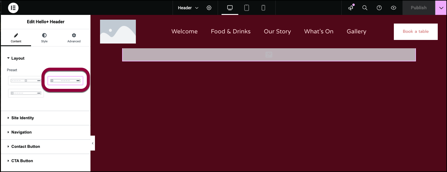
    The Elementor Editor opens with the Header visible.
    The Header options appear in the panel.

Customize the Header options

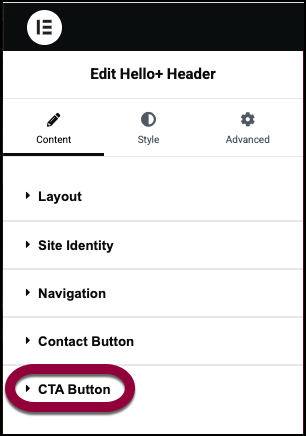
The Header has five sections:

  • Layout:  Select a basic layout for your header.
  • Site Identity: Use a logo or business name to identify the site.
  • Navigation: Create quick links to the site’s pages. 
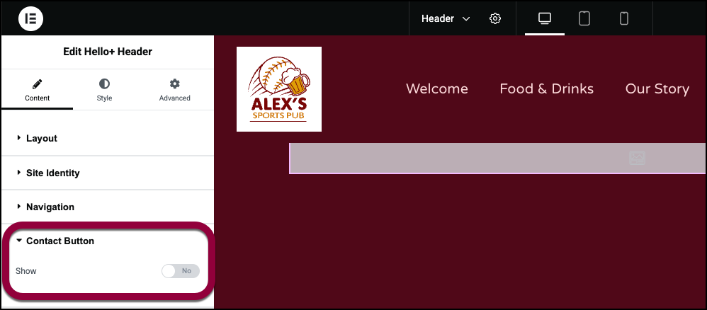
  • Contact Button:  Optionally add a button giving visitors an easy way to get in touch with you.
  • Call to Action: Provide visitors a quick way to interact with you. 
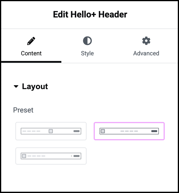
  1. In the Layout section, give your header a basic structure by selecting a basic design.  
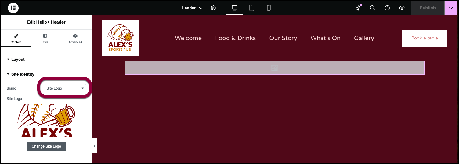
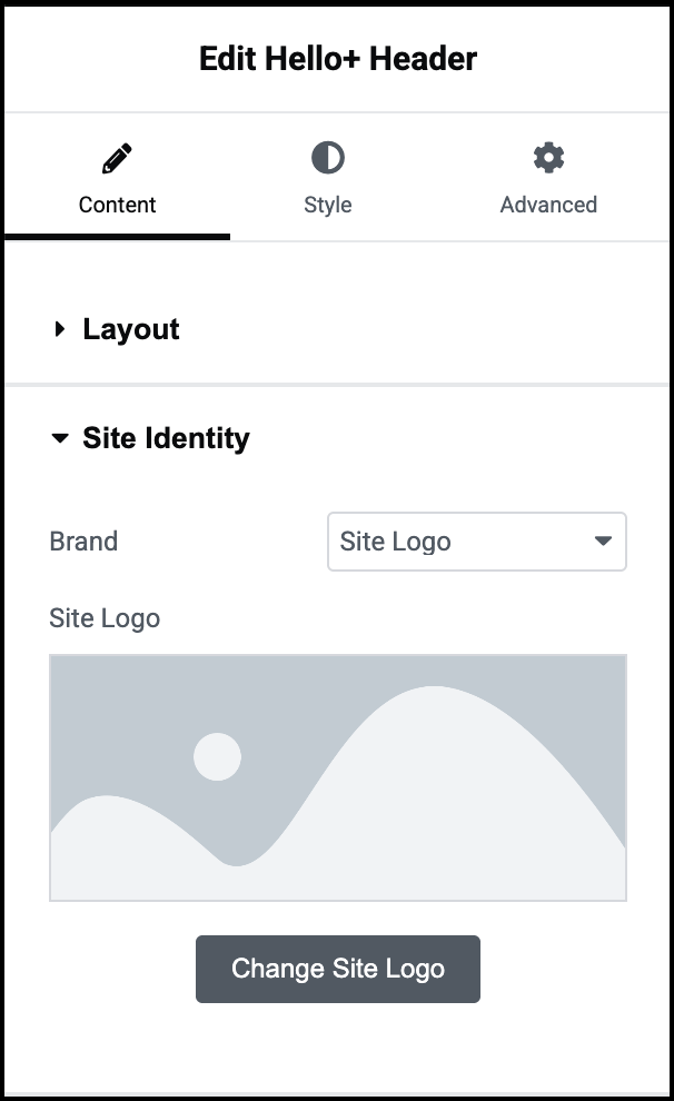
  2. In the Site Identity section in the Brand Field, the dropdown menu should be in the default position of Site Logo.

    Selecting a logo is part of customizing your site.
    You can change your logo by clicking Change Site Logo in the panel. For details, see Adding images and icons.

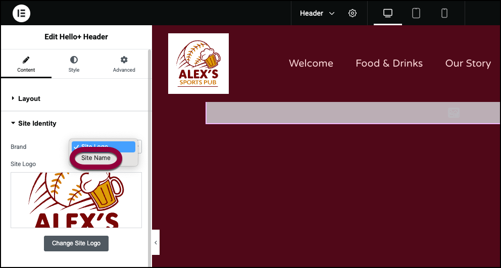
    If you prefer to use the site name in the Header, use the dropdown menu to choose Site Name.
  3. The Navigation section controls the quick links to the site’s other pages. For now, we’ll leave that at the default settings. See below for all the navigation options.
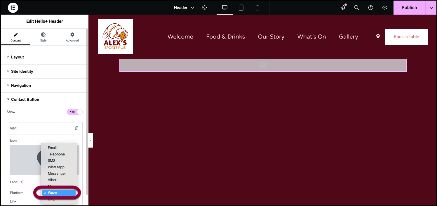
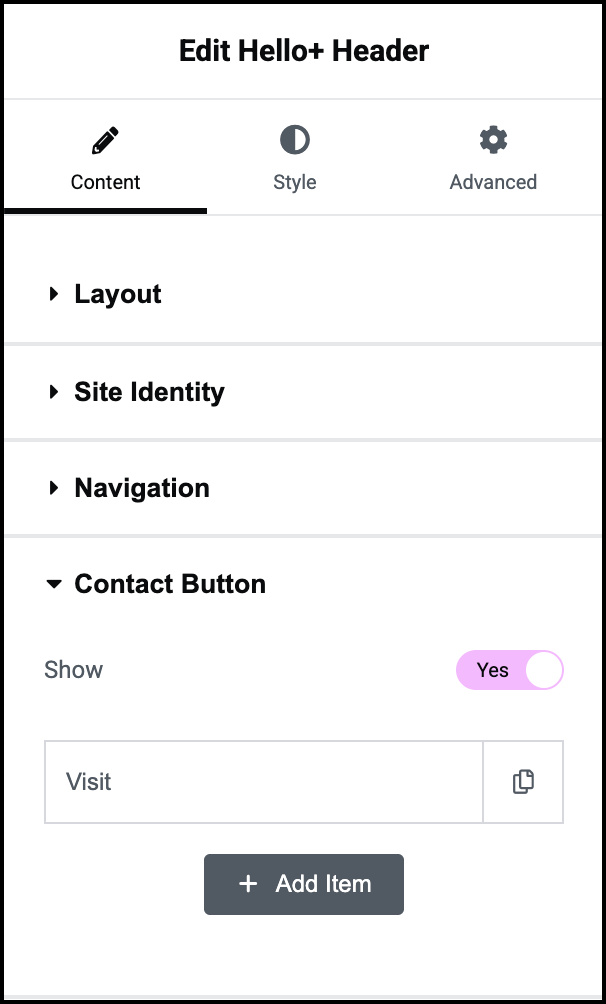
    The Contact button gives users a chance to either contact us or navigate to our pub. We’ll give users an easy way to find us by using Waze.
     
  4. Open the Contact Button field and toggle to Yes.

  5. Select Waze from the Platform dropdown menu.
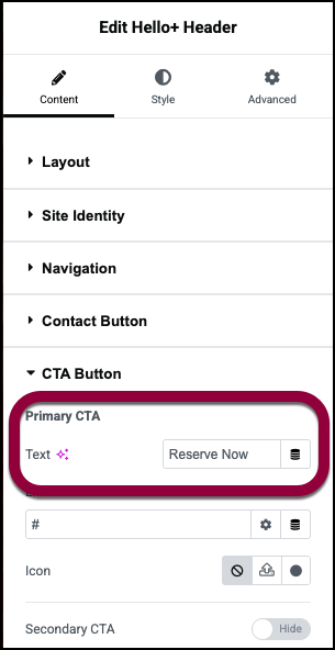
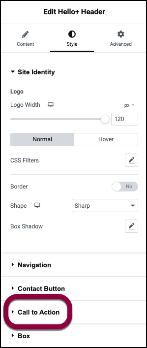
    The Call to Action section controls the button in the Header. Since this is a Header for a sports bar, we’ll put a link to the reservation form here.

  6. Open the Call to Action section.

  7. In the Primary CTA text box, enter Reserve Now.

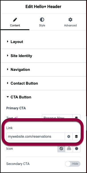
  8. In the Link field enter the URL of the reservation form.
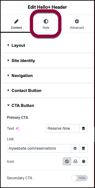
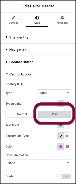
    Now let’s change the style of the Call to Action button so that it changes when users mouse over the button.

  9. Click the Style tab.
  10. Open the Call to Action section.
  11. Click Hover.
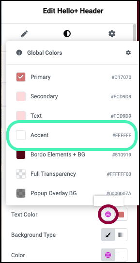
    Clicking Hover means that you are editing the style when users mouse over the button.

  12. Click the globe icon next to Text Color and select Accent.

  13. Click the globe icon next to Color and select Primary.
    When users mouse over the button the background and text colors will flip.

Settings for the Menu widget

You can customize your widgets using content, style, and other advanced parameters, offering you great flexibility in tailoring them to your needs. Click the tabs below to see all the settings available for this widget.

Content tab

Add, delete, and edit Header items and controls. 

Choose one of the basic layouts. You’ll be able to style this layout using the other sections of the Content and Style tabs.

Brand: Use the dropdown menu to choose:

  • Site Logo: display your logo in the header.
  • Site Name:  Display your company name in the Header. You can use the dropdown menu to change the HTML tag of the site name. We recommend using the default tag.
  • Change Site logo: If you’re using a logo, click to select a different logo. For details, see Adding images and icons.

This helps Accessibility apps identify the menu. You can change the menu name but we recommend using the default.

The Header uses the WordPress menu to create its quick links. If you have more than one WordPress menu, use the dropdown to select which menu to use. For details, see Create a navigation menu

Controls the navigation when the site is accessed from a mobile device.

Menu: By default, the menu is represented by a hamburger icon. To change this:

  • Click the upload icon to upload and use your own svg file.
  • Click the hamburger icon to open the icon library and choose an icon from there.

Breakpoint: Use the dropdown menu to choose:

  • Mobile: Have the Header use its mobile settings when accessed from a device less than 767 pixels wide.  
  • Table: Have the Header use its mobile settings when accessed from a device less than 1024 pixels wide.
  • None: Don’t use the Heading mobile settings.

Submenu indicator icon: Menu sometimes contain submenus. For example, the menu for Contact Us may contain submenu items such as: Reservations, Parties and Employment Opportunities. By default, these submenus are indicated by a down arrow, but this can be changed:

  • Click no icon to remove this indicator.
  • Click the down arrow icon to open the icon library and choose an icon from there.

Toggle On if you want to add a Contact icon(s) to your Header.

You can trigger a number of apps or actions from your header. This actions/apps are called a Platform:

  • Email: Lets visitors send you an email. If you use this, you’ll need to add:
    • Icon: Choose an image to represent sending an email.
    • Label: Give a name to the action/app. This will help accessibility programs understand what the icon represents.
    • Platform: Select Email from the dropdown menu.
    • Email: The email address where the email is sent.
    • Subject: Create a default subject line for the email.
    • Message: Create a default subject line for the email.
  • Telephone: Lets visitors easily call your business. If you use this, you’ll need to add:
    • Icon: Choose an image to represent sending making a phone call.
    • Label: Give a name to the action/app. This will help accessibility programs understand what the icon represents.
    • Platform: Select Telephone from the dropdown menu.
    • Number: The phone number they are calling.
  • SMS: Lets visitors send you messages.
    • Icon: Choose an image to represent sending an SMS.
    • Label: Give a name to the action/app. This will help accessibility programs understand what the icon represents.
    • Platform: Select SMS from the dropdown menu.
    • Number: The phone number they are texting.
  • WhatsApp: Lets visitors send you Whatsapp messages
    • Icon: Choose an image to represent sending an WhatsApp message.
    • Label: Give a name to the action/app. This will help accessibility programs understand what the icon represents.
    • Platform: Select WhatsApp from the dropdown menu.
    • Number: The phone number they are messaging.
  • Messenger: Lets visitors send you Facebook messages.
    • Icon: Choose an image to represent sending a message.
    • Label: Give a name to the action/app. This will help accessibility programs understand what the icon represents.
    • Platform: Select Messenger from the dropdown menu.
    • Username: Your businesses Facebook username. This is where the messages are sent. 
  • Viber: Lets visitors send you Viber messages or call you via Viber.
    • Icon: Choose an image to represent sending an Viber message or making a Viber call.
    • Label: Give a name to the action/app. This will help accessibility programs understand what the icon represents.
    • Platform: Select Viber from the dropdown menu.
    • Number: The Viber number they are messaging or calling.
    • Action: Use the dropdown menu to choose whether visitors will Chat or Call with Viber.
  • Map: Open Google Maps to guide visitors to your location.
    • Icon: Choose an image to represent sending launching Google Maps.
    • Label: Give a name to the action/app. This will help accessibility programs understand what the icon represents.
    • Platform: Select Maps from the dropdown menu.
    • Link: Link to the Google Maps app. For details see Google Maps integration.
  • Waze: Open the Waze app to guide visitors to your location.
    • Icon: Choose an image to represent sending launching Waze.
    • Label: Give a name to the action/app. This will help accessibility programs understand what the icon represents.
    • Platform: Select Waze from the dropdown menu.
    • Link: Link to the Waze app.
  • URL: Icon with a link to a webpage.
    • Icon: Choose an image to represent a link.
    • Label: Give a name to the action/app. This will help accessibility programs understand what the icon represents.
    • Platform: Select URL from the dropdown menu.
    • Link: The URL of the page visitors will be sent to.

By default, no icon appears on the button. You can change this:

  • Click the upload icon to upload and use your own svg file.
  • Click the dot icon to open the icon library and choose an icon from there.

Toggle to Show to add a second CTA button.

Enter the text you want to appear on the button.

Enter the URL you want visitors to access when they click the button.

By default, no icon appears on the button. You can change this:

  • Click the upload icon to upload and use your own svg file.
  • Click the dot icon to open the icon library and choose an icon from there.

Toggle to Show to add a second CTA button.

Style tab

Determine the look and feel of the Header.

Control the logo width if you’re using a logo or align the site name if you’re using the site name.

  • Normal:  Determine how the logo or site name appears by default. 
  • Hover: Determine how the logo or site name appears when moused over.  

When using a logo, determine:

  1. CSS filters: A series of sliders that lets you control:
    1. Blur: Applies a soft focus effect by blurring elements based on pixel radius.
    2. Brightness: Adjusts the brightness of an element by modifying its light intensity.
    3. Contrast: Enhances or reduces image and element color contrast for better visual distinction.
    4. Saturation: Adjusts image or element colors by increasing or decreasing their color intensity.
    5. Hue: The CSS hue filter adjusts colors by rotating their hue around the spectrum.
  2. Border: Use the toggle to determine if the logo will have a line around it. If you add a border, you’ll have to set the border width and color.
  3. Shape: Set a shape for the logo:
    1. Round: Buttons appear with smooth corners.
    2. Rounded: Buttons appear with evenly curved edges.
    3. Sharp: Rectangular buttons.
    4. Custom: Adjust the radius, using the four counters to adjust each individual corner. Learn more about these measurement methods. 
  4. Box Shadow: Click the pencil icon to add shadow to the toggle. Learn more about shadows.

When using you site name, set:

  1. Typography: When using the site name, Set the font type and size. For details, see Typography.
  2. Text shadow: Text Shadow: Add depth to your text with shadows. For details, see What is Shadow, Text Shadow and Boxed Shadow? 
  3. Text Color: When using the site name, set the font color. For details, see Choose a color or Use global fonts and colors.

Set the font type and size of the menu. For details, see Typography.

  • Normal:  Determine how the navigation menu appears by default. 
  • Hover: Determine how the navigation menu appears when moused over.  
  • Active: Determine how the navigation menu appears when selected.

Set the color of the navigation menu. For details, see Choose a color or Use global fonts and colors.

Use the slider to set the distance between the individual items in the menu.

Layout: If there is a submenu, use the dropdown menu to determine if the submenu items will appear:

  • Horizontally, from top to bottom.
  • Vertically, from side to side. 

Shape: If there is a submenu, determine the shape of the submenu:

  • Round: Buttons appear with smooth corners.
  • Rounded: Buttons appear with evenly curved edges.
  • Sharp: Rectangular buttons.

You can see how your site will look on different devices by clicking the Mobile, Tablet and Desktop icons in the top editor bar.

Text Align: When the site is accessed from a mobile device, determine if the menu items appear at the start of the header or in the center of the header.

Divider: Toggle to Yes if you want to add a divider between the menu items when the site is accessed from a mobile device. If you add a divider, you will also be able to choose:

Color: The color of the divider. For details, see Choose a color or Use global fonts and colors.

Weight: The thickness of the dividers.

Toggle Icon Size: On mobile the menu is replaced by a toggle icon. Visitors tap the toggle to open the menu. Use the slider to adjust the size of the icon.

Normal/Active:

  • Normal:  Determine how the toggle that displays the menu appears by default. 
  • Hover: Determine how the toggle that displays the menu appears when moused over.  

Toggle Icon Color: Determine the color of the toggle that displays the menu. For details, see Choose a color or Use global fonts and colors.

Type: Use the dropdown to determine if the Contact will display as an Icon or a Label. 

  • Normal:  Determine how the button or link appears by default. 
  • Hover: Determine how the button or link appears when moused over. 

Determine the look and feel of the icon:

  • Color: Set the color of the icon. For details, see Choose a color or Use global fonts and colors. 
  • Size: Set the size of the icon.
  • Spacing: Determine the amount of space between the contact button and the CTA.
  • Responsive Display: Set how the menu looks on mobile:
    1. Navbar: The contact button appears alongside the hamburger menu.
    2. Dropdown: The contact button appears in the hamburger menu.

Set the look of the contact button’s label:

  • Color: Set the color of the label. For details, see Choose a color or Use global fonts and colors. 
  • Spacing: Set the amount of room between the label and the CTA button.
  • Responsive Display: Set how the menu looks on mobile:
    1. Navbar: The contact button label appears alongside the hamburger menu.
    2. Dropdown: The contact button label appears in the hamburger menu.

Use the dropdown menu to select Stretch if you want the CTA button to spread across the entire width of the Header when accessed from a mobile device. 

Type: Use the dropdown to determine if the CTA will appear as a button or as a link. 

Set the font type and size of the button or link. For details, see Typography.

  • Normal:  Determine how the button or link appears by default. 
  • Hover: Determine how the button or link appears when moused over. 

Set the color of the button or link text. For details, see Choose a color or Use global fonts and colors.

(Button only)

Use the to switch between:

  • Solid background (Classic)
  • Blended background (Gradient).

For details, see Create a Background.

The color of the background. For details, see Choose a color or Use global fonts and colors.

(Button only)

Toggle to Yes to add a border to the CTA button. If you add a border, you’ll have to determine:

Click the pencil icon to add shadow to the toggle. Learn more about shadows.

Add space between the button’s borders and the text. For details, see Padding and margins.

Use the dropdown menu to select Stretch if you want the CTA button to spread across the entire width of the Header when accessed from a mobile device. 

Background type: Set a background for the Header. Use the icons to switch between a solid background (Classic) or a blended background (Gradient). For details, see Create a Background.

Color: The color of the background. For details, see Choose a color or Use global fonts and colors.

Toggle to Yes to add a border around the Header. If you add a border, you’ll need to determine:

Click the pencil icon to add shadow to the Header. Learn more about shadows.

Add space between the Header’s border and the contents. For details, see Padding and margins.

Advanced tab

Control the placement of your widget, insert links, add custom code and more.

Most of the options avaialble in the Advanced tab can be found in Advanced tab settings.

Behavior is an additional function. It allows you to select:

Float: Toggle to Yes to allow the Header to hover over other content on the page.

If you toggle Float Yes, you’ll have these options:

  • Offset: The distance between the top of the Header and the top of the screen.
  • Width: Set the width of the floating area.
  • Shape: Set the floating are to be:
    • Round: Smooth corners.
    • Rounded: Evenly curved edges.
    • Sharp: Rectangular.

Sticky: The sticky property keeps the Header visible even when the visitor scrolls through the content. Options are:

  • On scroll up: Header becomes sticky as soon as visitor starts scrolling back up the page.
  • Always: Header is always sticky.
  • Never: Header is not sticky. 

Learn more about the Advanced tab settings.

On this page

Share this article